- Home
- Services
- IVY
- Portfolio
- Blogs
- About Us
- Contact Us
- Sun-Tue (9:00 am-7.00 pm)
- infoaploxn@gmail.com
- +91 656 786 53
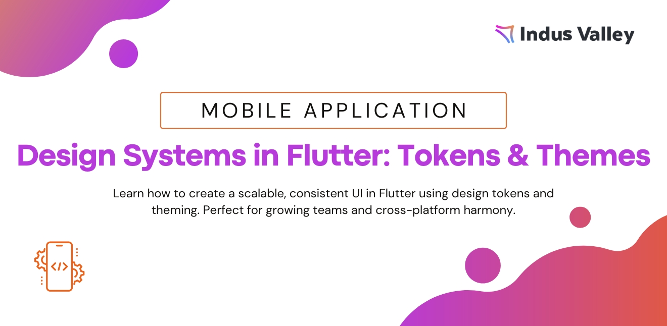
A design system is more than just a visual guide or UI kit. It’s a consistent, reusable set of principles, patterns, and components used across an app enabling me and my team to scale efficiently.
At its core, a design system in Flutter includes:
● Design Tokens (spacing, color, typography, etc.)
● Component Library (buttons, cards, fields, etc.)
● Themes (light, dark, brand-specific)
● Documentation (for consistency and onboarding)
Design tokens are the atomic design values (like color hex codes, font sizes, padding values) stored in variables with semantic naming.
Instead of hardcoding like this:
  Container(
  padding: EdgeInsets.all(16),
  color: Color(0xFF0066FF),
 )
I started writing:
  Container(
  padding: EdgeInsets.all(AppSpacing.md),
  color: AppColors.primary,
 )
This abstraction made everything in my app more predictable, consistent, and easier to change globally.
I created a dedicated folder: lib/designsystem/.
Inside it, I added files like:
● appcolors.dart
● appspacing.dart
● apptypography.dart
● appradius.dart
Here’s how each one looks:
 import ’package:flutter/material.dart’;

 class AppColors {
  static const primary = Color(0xFF0066FF);
  static const secondary = Color(0xFF00C2A8);
  static const background = Color(0xFFFFFFFF);
  static const textPrimary = Color(0xFF1C1C1E);
  static const textSecondary = Color(0xFF7E7E7E);
 }
  class AppSpacing {
  static const xs = 4.0;
  static const sm = 8.0;
  static const md = 16.0;
  static const lg = 24.0;
  static const xl = 32.0;
 }
  class AppRadius {
  static const sm = 6.0;
  static const md = 12.0;
  static const lg = 20.0;
 }
Instead of repeating TextStyle or Container styling all over the place, I wrapped them into semantic components.
 import ’package:flutter/material.dart’;
 import ’../designsystem/appcolors.dart’;

 class HeadingText extends StatelessWidget {
  final String text;

  const HeadingText(this.text, {super.key});

  @override
  Widget build(BuildContext context) {
    return Text(
      text,
      style: TextStyle(
        fontSize: 24,
        fontWeight: FontWeight.bold,
        color: AppColors.textPrimary,
      ),
    );
  }
 }
Now I can use:
HeadingText(’Welcome to the App’);
This simplified my screens and kept my design consistent.
Flutter’s ThemeData allows me to define global styles. I created a theme using my tokens like this:
 import ’package:flutter/material.dart’;
 import ’app_colors.dart’;

 final ThemeData appTheme = ThemeData(
  primaryColor: AppColors.primary,
  scaffoldBackgroundColor: AppColors.background,
  textTheme: const TextTheme(
    headline6: TextStyle(
      fontSize: 20,
      fontWeight: FontWeight.w600,
      color: AppColors.textPrimary,
    ),
    bodyText2: TextStyle(
      fontSize: 14,
      color: AppColors.textSecondary,
    ),
  ),
  elevatedButtonTheme: ElevatedButtonThemeData(
    style: ElevatedButton.styleFrom(
      backgroundColor: AppColors.primary,
      textStyle: const TextStyle(fontSize: 16),
      shape: RoundedRectangleBorder(
        borderRadius: BorderRadius.circular(AppRadius.md),
      ),
    ),
  ),
 );
And I used it in main.dart:
  MaterialApp(
  theme: appTheme,
  home: const HomeScreen(),
 );
With tokens and theming in place, I built reusable UI components. Here’s a simple card component:
 import ’package:flutter/material.dart’;
 import ’../designsystem/appcolors.dart’;
 import ’../designsystem/appspacing.dart’;
 import ’../designsystem/appradius.dart’;

 class AppCard extends StatelessWidget {
  final Widget child;

  const AppCard({required this.child, super.key});

  @override
  Widget build(BuildContext context) {
    return Container(
      padding: const EdgeInsets.all(AppSpacing.md),
      decoration: BoxDecoration(
        color: AppColors.background,
        borderRadius: BorderRadius.circular(AppRadius.md),
        boxShadow: [
          BoxShadow(
            color: Colors.black12,
            blurRadius: 6,
            offset: Offset(0, 4),
          ),
        ],
      ),
      child: child,
    );
  }
 }
Usage:
AppCard(
  child: Column(
    crossAxisAlignment: CrossAxisAlignment.start,
    children: [
      HeadingText("John Doe"),
      const SizedBox(height: AppSpacing.sm),
      Text("Software Engineer"),
    ],
  ),
 ),
At first, I created tokens for shadow opacity and border width which made things complicated. Now, I only tokenize:
● Colors
● Typography
● Spacing
● Radii
I use AppSpacing.md not AppSpacing.value16, because it’s meaningful, not just numerical.
I sometimes use extensions for padding to clean up layout code:
extension PaddingX on Widget {
  Widget padAll(double value) => Padding(
        padding: EdgeInsets.all(value),
        child: this,
      );
}
Usage:
HeadingText(’Hello’).padAll(AppSpacing.md);
I’m now exploring:
● Design token syncing with Figma using tools like Style Dictionary or Token Studio
● Shared packages like designsystemcore across multiple apps
● Dark theme support via ThemeMode and dynamic tokens
Building my design system in Flutter with tokens wasn’t just a good decision it was a turning point. It brought consistency, reusability, scalability, and clarity to my apps.
What started as an experiment has now become my default approach for every new project.
If you haven’t tried using tokens yet, start with your next screen. Create a design_system/ folder, define your colors and spacing tokens, and build from there. I promise, your codebase and your future self will thank you.
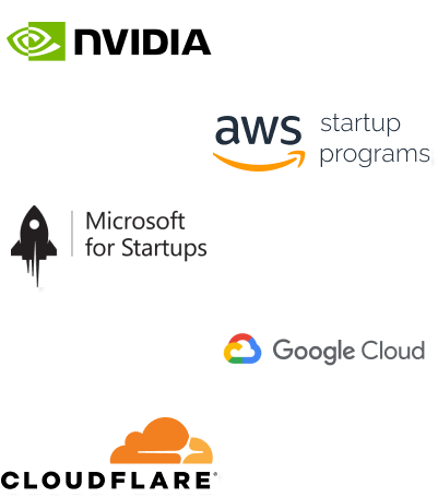
Imagine reducing your operational costs by up to $100,000 annually without compromising on the technology you rely on. Through our partnerships with leading cloud and technology providers like AWS (Amazon Web Services), Google Cloud Platform (GCP), Microsoft Azure, and Nvidia Inception, we can help you secure up to $25,000 in credits over two years (subject to approval).
These credits can cover essential server fees and offer additional perks, such as:
By leveraging these credits, you can significantly optimize your operational expenses. Whether you're a startup or a growing business, the savings from these partnerships ranging from $5,000 to $100,000 annually can make a huge difference in scaling your business efficiently.
The approval process requires company registration and meeting specific requirements, but we provide full support to guide you through every step. Start saving on your cloud infrastructure today and unlock the full potential of your business.
